Welcome to the Tilt West Journal
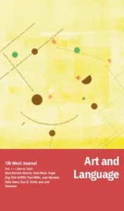
The long-awaited publication by Tilt West has arrived!

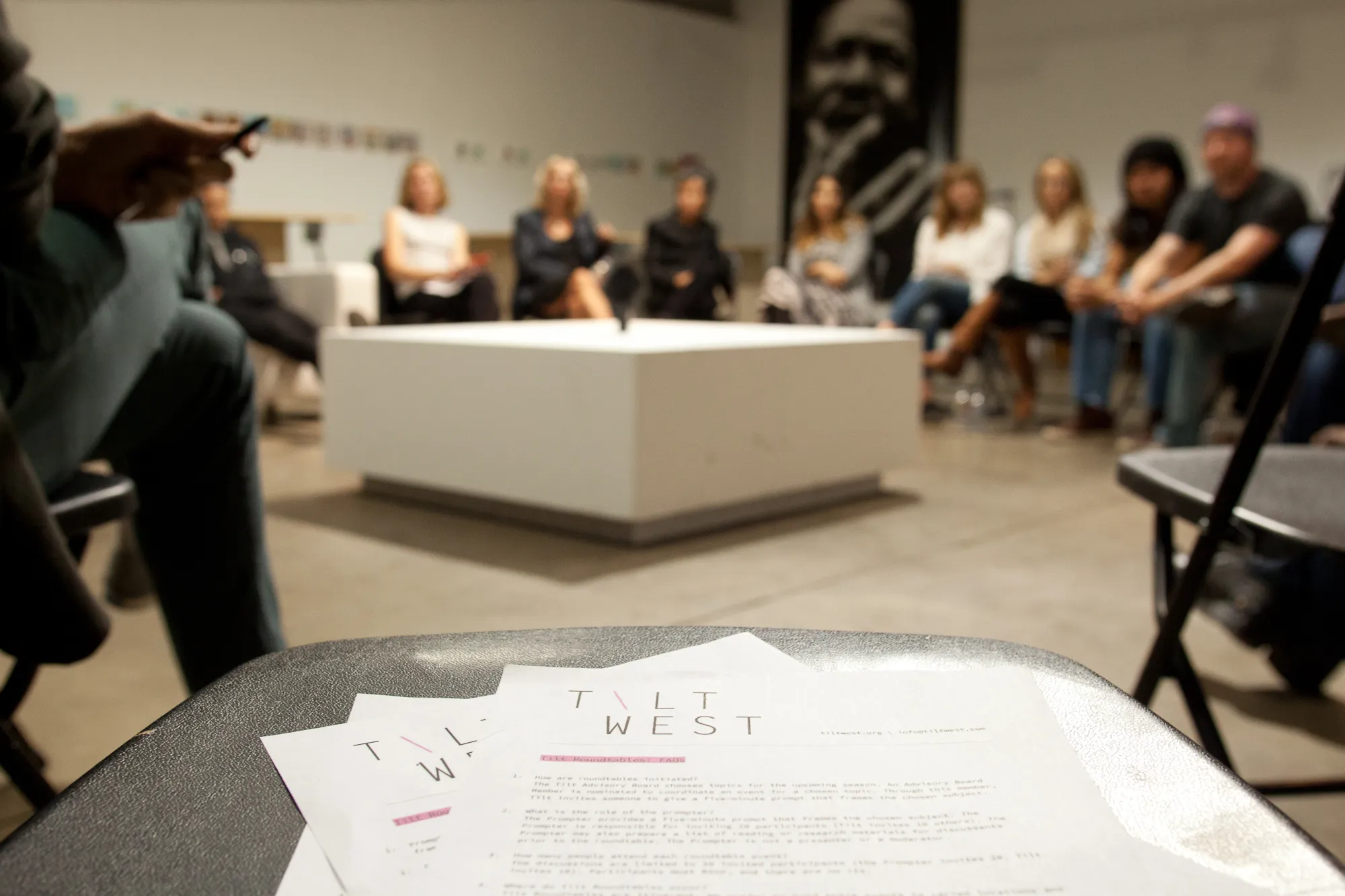
The Tilt West Journal has had a long runway, discussions dating all the way back to 2015 before Tilt West, the organization, even existed. At that time, a small group of interested artists and creatives felt compelled to fill a gap in Denver’s culture scene — a need for critical discourse and dialogue. I had been tapped because those early conversations centered on a publication. But because Tilt West started with nothing but the collective savvy of its original founders, we made the decision to launch Tilt West through our roundtable discussions first. The desire to build a publication was always just under the surface.

Having worked in art museums for a long time, I had witnessed, and indeed contributed to, many digital “publications.” Call them websites, or microsites, or apps, or web apps, or e-books, or blogs … I affectionately call them technical debt. Sometimes necessary, always beautiful.
I had learned that digital media is the most fragile media we handle. Film degrades, paint discolors, textiles break down. But those processes happen before our eyes, often taking decades if not centuries. Digital media can disappear in an instant at the hand of unseen forces beyond your control; and due to its invisibility, you may not discover that it’s been broken or lost for years to come. Or maybe it’ll stay preserved but locked up in a proprietary format, waiting to be transferred or updated, while the company who supports the format rides off into the sunset of technological obsolescence.
The allure of digital, with its sexy flexibility and promises of wide distribution, makes it irresistible. But the care and feeding of digital media is indeed boring and tedious, and yes, expensive too. And certainly the content — the creative and the scholarly — which is inevitably wrapped up in the format, deserves careful consideration for its long-term presentation. My vision for the Tilt West Journal was to build something smart. Something with flexibility, accessibility, discoverability, and longevity at its core.
Working with a digital publishing framework developed by the Getty Museum known as Quire, Tilt West became an early adopter of a bleeding edge technology developed for long-term, multi-format scholarly publishing.
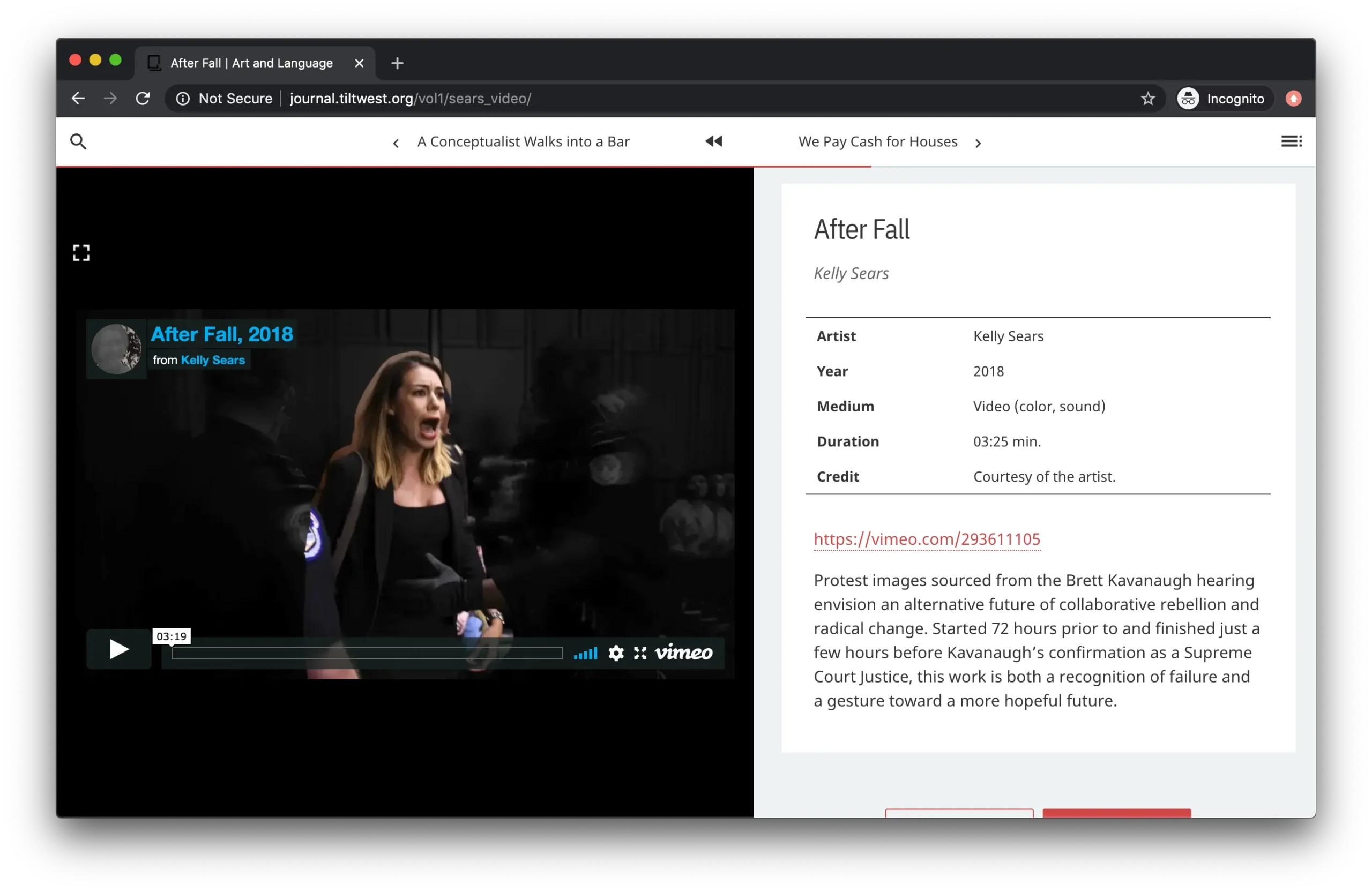
The interface is meant to feel like a book with a linear progression through the content, but with the flexibility of non-linear navigation of online environments. Digital also allows us to present time-based media like video and audio.

The Journal is readable by people and machines, making it accessible and searchable online. It is also available in multiple formats in order to exist where people consume books and journals, including a website, e-pub and kindle formats, and a PDF version. Printed books are available for purchase as well. All from the same set of source files — a digital strategist’s dream come true.
Perhaps most importantly, the framework minimizes dependencies on machinery, money, and maintenance by taking all the files that make up the Journal and generating a static website to ensure the issue’s stability and sustainability through time.

The Tilt West Journal is a work of conceptual brilliance. The content that makes up its pages evokes the same multi-faceted, cross-disciplinary, and non-hierarchical approach that has become the ethos of our organization. And technically speaking, the Journal impossibly straddles the digital world and the analog one, with optimal flexibility, accessibility, discoverability, and longevity at its core. Although it’s taken some time to create, we know it was worth the wait.
